
Multispectral Imagery for Early Crop Stress Detection
Learn how multispectral cameras detect crop stress weeks before it's visible to the naked eye, enabling earlier intervention.
Raw satellite imagery isn't useful until you process it. Learn the workflow for generating variable-rate application maps from multispectral data.
Editorial Team
Written by the AgroVision Labs editorial team, focused on practical, transparent guidance for agricultural and forestry imaging professionals.
You've downloaded satellite data — bands 2 through 8 from Sentinel-2, maybe some Landsat 8 thermal. Now what? The gap between raw pixel values and a map you can actually use in the field is bigger than most people realize. It's not just a matter of clicking a button.
The workflow starts with atmospheric correction. Raw digital numbers aren't reflectance values — they're sensor measurements affected by water vapor, aerosols, and Rayleigh scattering. You're looking at what the sensor recorded, not what the ground actually reflects. That's why we don't skip this step. Tools like FLAASH or iCOR handle this, though you'll want to understand what they're doing before you trust the output.
After correction, you've got calibrated reflectance data. But here's where people get stuck: multispectral data has 10+ bands, and most traditional visualization shows RGB only. You've got infrared, red-edge, SWIR — all this information that tells you about plant health, water stress, soil properties. Picking which bands to look at, and how to combine them, is where the real analysis begins.
The most common move is calculating indices. NDVI — Normalized Difference Vegetation Index — is the starting point for most agriculture applications. You're taking the difference between near-infrared and red reflectance, normalized to a scale of -1 to 1. That single number tells you chlorophyll content, leaf area, and biomass in a way that straight RGB just can't.
But NDVI isn't the end of the story. Red-edge NDVI uses the red-edge band (around 740 nm) instead of standard red, and it's more sensitive to chlorophyll in healthy plants. GNDVI swaps green for red. EVI2 adds a correction for atmospheric and canopy background effects. Each one answers a slightly different question about what's happening in your field.
The key is matching your index to your question. Are you looking for general crop vigor? NDVI works. Trying to catch stress earlier? Red-edge NDVI catches it about 2-3 weeks sooner than standard NDVI. Need soil moisture signals? NDMI uses SWIR bands. This is where domain knowledge beats pure automation.
Once you've calculated indices, you're ready for classification. The simplest approach is thresholding — anything above NDVI 0.6 is healthy, 0.4-0.6 is moderate, below 0.4 is stressed. Quick, transparent, works well if your field's conditions are consistent.
More sophisticated methods use clustering. K-means clustering groups pixels with similar spectral signatures into classes automatically. You decide how many classes (zones) you want — 3 for variable-rate fertilizer, 5 for more granular management. The algorithm finds natural boundaries in your data.
Machine learning classification goes deeper. You train a random forest or SVM on known pixels — areas you've verified as healthy, stressed, etc. — then predict the rest. Takes more setup but captures complexity that simple thresholding misses. The catch? You need good training data, and models don't always transfer well between fields or years.
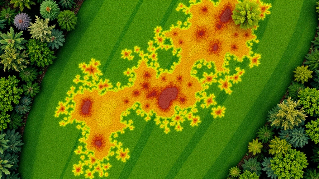

This is where satellite data becomes actionable. Your classification — those zones you've defined — gets converted into prescription maps. If you've got 3 vigor zones, you assign fertilizer rates to each. Zone 1 gets 150 lb N/acre, Zone 2 gets 180, Zone 3 gets 210. The map tells your applicator exactly what to apply where.
The challenge is resolution and accuracy. Sentinel-2 gives you 10m pixels. That's good for broad patterns but might miss small problem areas. Landsat 8 is 30m — even coarser. If your field's variability happens at the 20-50 meter scale, satellite resolution captures it. If stress patches are smaller, you might need drone imagery (2-5 cm resolution) or a combination approach.
Validation matters. Don't assume your classification is correct just because it looks reasonable. Ground-truth a few zones — walk the field, check plant samples, measure yields. Real field data is your quality control. If classification is off, you adjust thresholds or retrain your model before applying it at scale.
Atmospheric correction done wrong is the most common mistake. If you skip it or use the wrong algorithm, you're comparing apples to different fruit. Shadows from clouds matter too — a 5% cloud cover can skew your NDVI by 0.05-0.1 points, enough to misclassify zones. Always check cloud percentages in metadata before you process.
Temporal aliasing trips people up. A single satellite pass shows you one moment in time. Crops change fast — a stress event might last 3 days and you miss it entirely if the satellite didn't pass overhead. Time-series analysis (multiple dates) is more reliable than single-date classification. It's also why consistent timing matters — comparing June 15 to June 25 tells you real change. Comparing June to August tells you normal seasonal progression.
Over-complicating the model is real. A three-zone NDVI classification applied across 500 acres often outperforms a random forest with 50 features trained on 20 ground points. Simpler models generalize better, they're easier to explain to agronomists, and you can validate them faster. Build the simplest model that answers your question. Add complexity only if it improves results measurably.
This article provides technical information about satellite image processing workflows. Results depend on data quality, atmospheric conditions, crop type, and field-specific factors. Always validate classifications with ground truthing before applying variable-rate prescriptions at scale. Consult with agronomists or image analysis specialists for field-specific guidance.
You've got your variable-rate map. Now it needs to reach your applicator — whether that's a spreader, sprayer, or seeder. Most modern equipment accepts shapefiles or raster GeoTIFFs with rate zones encoded as pixel values. Your GIS software exports these; the equipment reads them during application.
The workflow closes when you collect yield data. Compare yields from high-rate zones versus low-rate zones, accounting for other variables. Did the higher rate in stressed zones actually improve yield, or just cost money? This feedback loop is how you refine your approach for next season. Each year, your classifications get better because you're learning what actually works in your soil and climate.
Satellite data is abundant and cheap now. The barrier isn't access to imagery — it's the knowledge to turn it into decisions. That's what separates reactive management from informed variable-rate application. You're not guessing which zones are stressed; you're measuring them, quantifying the problem, and prescribing accordingly.
Explore more articles about satellite imagery and precision agriculture
Learn how multispectral cameras detect crop stress weeks before it's visible to the naked eye, enabling earlier intervention.

Track forest canopy changes month-to-month using freely available satellite imagery to detect disease and stress patterns.
RGB cameras versus multispectral versus thermal — understand what each sensor type reveals and which fits your management needs.